
Football Heat Maps Explained: What They Really Show
This post contains affiliate links. As an Amazon Associate, we earn from qualifying purchases.
Football heat maps explained: a heatmap is a colour overlay showing where a player or team was most active. Public maps use event data, so they show ball touches. Tracking maps show actual position. Colour doesn’t equal quality, and one match can mislead.
That difference between ball-touch maps and position maps is where most arguments start. A dense red zone can mean a midfielder had the ball a lot, or it can mean a defender was positioned centrally while the event file missed the quiet work. The same colour can hide very different jobs.
What follows: the two data sources, the colour scales, the kick-off trap that fooled a famous match, and the checks that stop a heatmap from lying to you.
Key Takeaways
- Event maps plot touches, while tracking maps plot where players actually stood.
- Combine five or more matches before judging a player from a single heatmap.
- One study found defenders had the highest correlations between event and tracking heatmaps, while forwards had the lowest.
- Pair heatmaps with footage, because colour shows location. It hides pass quality and off-ball runs.
- Check the grid scale, because grouping events into different pitch divisions changes the picture.
Football Heat Maps Explained: The Histogram Rule
The red blob is a histogram. Each zone on the pitch holds a count, and the colour shows how many actions or samples landed there. On a phone, it looks like a weather map: red blooms in busy zones, pale blue in dead zones.
Event heatmaps group ball actions by pitch coordinate, while tracking heatmaps use positional samples to show occupancy. A pitch divided into P=36 divisions, such as a 6 by 6 grid, produced the highest correlation between event and tracking heatmaps in one study.
A heatmap can show passes per 90 minutes. That levels short appearances and full matches. It can also show tackles, interceptions, pressures, or shooting chances. The label matters more than the colour.
A common color gradient in football heatmaps is green (low activity) to red (high activity). That gradient is a reading shortcut. It doesn’t grade performance.
Some maps add a single arrow for average pass direction. That arrow can point to the box even when passes went wide and central.
Why Event Maps and Tracking Maps Tell Different Stories
Do you know which file made your map? Most public heatmaps on Sofascore, FotMob, and Opta-powered pages are on-ball. They use event data, meaning each pass, shot, dribble, or tackle gets a coordinate. A midfielder with many touches can have a denser map than a striker with fewer, even if their movement is similar.
Tracking maps are different. They record where players stood, even when the ball was nowhere near them. One event versus tracking heatmap study found tracking datasets capture position with a resolution of some centimetres and sampling rates below a second. That is why they can reveal recovery runs, defensive lines, and spaces that never got a touch.
Event data: where the ball met the player
Event maps are easy to publish because many leagues sell event files. They show involvement. They can tell you where a player touched the ball most. They can’t show the full picture of movement. A striker who made decoy runs leaves almost no colour.
Tracking data: where the player actually was
Tracking maps show occupancy, or where players stood. They answer a different question: where was this body on the pitch, minute by minute? For that, a guide on how tracking data works explains the gap between optical systems, cameras, and wearables.
Sources disagree on how to treat the difference.
| Map type | Best for | Main blind spot | | Event map | ball involvement | off-ball runs | | Tracking map | positional occupancy | action quality | | Possession map | where control happened | why control happened | | Pressing map | where pressure happened | pass quality |
I treat a single-match heatmap as a clue, not a verdict. If the story needs one red blob to prove a plan, I go back to the footage and watch what happened around it.
How to Read a Football Heat Map Without Being Fooled
Five checks stop most heatmap mistakes. The red smear glows under a phone screen, but the crowd noise tells whether the flank was live. Start there, then look at the data behind the picture.
The 5-Check Reading Method
- Name the source. Event, tracking, possession, or pressing? If the label is missing, the map can’t show what you think. Skipping this step allows a ball-touch map to be mistaken for a position map.
- Check the time window. A red card, a substitution, or a deep defensive block can distort one match. One common recommendation is to aggregate over five or more matches before drawing conclusions from a heatmap. One match can overstate a plan.
- Compare touch count. A 30-touch midfielder can have a denser map than a 15-touch striker. That proves volume. It proves nothing about quality.
- Look for deliberate shape. A bright left side can signal an overload. A cold right side can signal a trap. Reading it as error hides the plan.
- Add a second metric. Heatmaps show location. Pair them with a control measure or a pressing measure. Without them, dominance and repeated mistakes look the same.
Easy to miss: A striker’s sparse on-ball map can look like a poor performance for 90 minutes, even when tracking shows repeated runs that stretched the centre-backs.
| Symptom | Likely cause | What to check next | | Red centre circle | kick-off passes | set-piece count | | Sparse striker map | on-ball source | tracking occupancy | | One hot flank | deliberate overload | opposite channel | | Pulled-back map | low-block game state | possession context |
Game state means the score and possession context. Do not read one match as a season verdict. A red card can shrink a map within 20 minutes. Do not treat a cold flank as a weakness. A cold flank can signal a trap, with space waiting on the opposite side.
I use this check before trusting a map. A coach’s match analysis starts with video, then adds maps. If you want a cleaner control measure than possession, field tilt shows territory share. If you want a pressing check, PPDA counts passes allowed per defensive action. A bright left side can signal an overload, so overloads and underloads explain why one flank can run hot while the other stays cold.
Suarez’s Centre-Circle Map Is the Cleanest Warning
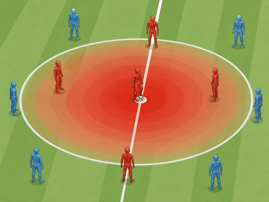
Suarez’s centre-circle map is the cleanest warning in public football analytics. The map glowed red in the middle circle after Barcelona’s 8-2 loss to Bayern Munich in the 2020 UEFA Champions League quarter-final. It looked like Suarez had lived in midfield. The reason was simple.
That edge case breaks the standard reading. An event heatmap counts actions where they happen. Kick-offs happen in one place. A striker returning for restarts can create a hot centre circle, even if Barcelona chased the game from deep.
That number is variance, or the spread of differences. Low touches don’t guarantee a bad map. Position matters more.
A structured match analysis would catch this by checking set pieces before blaming the player’s role. The map showed the kick-offs. The reader missed them.
What Heat Maps Do Well for Coaches, Scouts, and Fans

A reader once asked whether a heat map could explain a player’s performance. I said no. The map showed his location. The action lived elsewhere. I then watched the match again and found two quiet runs that never touched the ball, but created the space for the pass that mattered.
A heatmap is like a spice jar. It shows what was used. It doesn’t say whether the dish tasted good. Use heatmaps as a first pass. A final verdict needs footage. A heatmap can show a full-back living in the attacking half, a centre-back holding a high line, or a striker pinned to one channel. It gives a quick shape before you watch the match.
- Scouting: a map shows whether a player fits a zone. A winger who never reaches the final third doesn’t suit a high-possession side.
- Opposition prep: a cold left channel hints at space to attack. A bright right flank warns that the opponent is building there.
- Fan analysis: a season heatmap shows a role change. Messi’s gradual shift from right wing to central playmaker shows it well.
- Player development: compare home and away maps. A wide map at home and a pulled-back map away show tactical flexibility.
For shooting analysis, one PMC football shooting opportunity study used positional data at 25 frames per second. It mapped chances when the ball was in the last 30 m of the pitch. In the observed match, most shooting opportunities lasted between 1 and 2 seconds. In that study, only a few shooting opportunities lasted more than 2 seconds. That timing changes the read. A bright zone near the box is a place to be ready for a very short window.
The study divided the last 30 m using the penalty area. In that study’s analysis, the penalty area extended 16.5 m to each side of the goal and 16.5 m in front of it.
Most clubs use football analytics to turn raw coordinates into recruitment and opposition reports. A bright central corridor can signal a search for the half-spaces, the lanes between wing and centre. Which side was cold, and why? A coach can answer that faster with a second metric. I can’t build a model from raw tracking files, so I use heatmaps as a prompt for video.
Which Tools Give You the Best View?

Free apps show ball-touch maps. Paid or professional platforms add tracking, filters, and deeper context. Your question decides the tool.
- Quick match check: Sofascore and FotMob give free player heatmaps soon after a match. WhoScored adds match context.
- Deeper pass work: FBref and Understat offer free passing and positional views for major leagues.
- Off-ball occupancy: StatsBomb 360 and Second Spectrum are better for tracking-based maps. Skillcorner also works in this space.
- Scout-grade filtering: Wyscout and InStat let you filter by game state, minutes, or opponent (the kind of filter that saves a scout an hour). Opta-powered tools sit in the same professional tier.
Simple. If you only want a free post-match check, Sofascore and FotMob are enough. If you want off-ball occupancy, StatsBomb 360 or Second Spectrum is the better place to look.
What do heat maps look like for different positions?
A player’s role shapes their heat map. Defenders often show the strongest match between where they are and where they act, like making tackles. Forwards, however, can have a weaker link, as their off-ball runs may not show up on an on-ball map. A midfielder with many touches will have a denser, redder map than a striker with fewer, even if their movement is similar. This is because common public maps are built from event data, which overweights high-volume players. Specialized maps exist too, like pressing maps for defensive actions or possession maps showing where a player controlled the ball.
What tools can I use to see or make heat maps?
Different tools use different data. For free viewing, public sites like Sofascore, FotMob, and WhoScored provide on-ball heat maps built from event data. For a fuller picture, professional tools from companies like StatsBomb, Second Spectrum, and Wyscout use tracking data to show a player’s actual occupancy on the pitch, regardless of the ball. Creating a heat map typically involves collecting precise positional data at regular intervals, then using smoothing techniques to create the final visual. Always check what data a map is built from before interpreting it.
Frequently Asked Questions
How does a football heat map work?
Heat map converts actions or position samples into counts by pitch zone. Smoothing blends nearby zones into a soft cloud. The colour shows relative activity. It doesn’t show value.
What is the difference between a touch map and a position map?
Touch map comes from event data and shows where the ball met the player. A position map comes from tracking data and shows where the player stood. The two answer different questions.
Why does my striker’s heat map look empty?
Public apps use on-ball data. A striker can spend long spells without touching the ball, then still make runs that stretch defenders. Check tracking data before calling the performance quiet.
How many matches should I use before trusting a heat map?
Combine five or more matches before drawing a conclusion. One match can carry a red card, a substitution, or a game state that warps the shape. A longer sample gives a clearer role.
Before You Go
Football heat maps explained in one rule: read the source label before the colour. If the map is event-based, it shows touches. If it is tracking-based, it shows occupancy. That one check prevents most bad takes.
If you only have one match, stop before judging. A kick-off hotspot, a red card, or a low block can distort the picture within 20 minutes. Wait for five games, then compare with footage.
I still like the simple version. A heatmap is a map of where the game happened. It becomes useful when you ask what happened around the colour.
The notebook still smells like wet grass.
